DESIGN EXERCISE, MARCH 2018
In this design exercise, I’ll be improving a hypothetical workflow of an animal lab and focusing on the monitoring part of problems. I created the first iteration of wireframes and Hi-Fi mockups of the solution. This includes rough wireframes of most important web page sections, Hi-Fi screens of “Overview” section, solutions for monitoring vital parameters of animal data, managing animal data, accessibility tests, and more.
Tasks & Problems
We have a current data set: foxes, rabbits, wolves, elephants and bats. All of them have a color, they are either awake or asleep and they are walking or sitting at home. For each animal it should be possible adjust the color and tail size, monitor the temperature of the nose and texture of the fur. User 1 and User 2 maintain the animals and their information. They can create new ones and alter and delete the existing ones. User 1 makes sure the animals are healthy, not hungry or thirsty and go outside at least once a day. Wolves hate the sunlight but need a lot of space and rabbits cannot be out at the same time as wolves or foxes. User 2 adjusts tail sizes and colors once in a while and fur textures every 2 weeks. User 2 also orders all the food supplies every month and needs immediate updates on births and deaths.
Tools
Sketch App, Abstract, Principle for Mac, Adobe Photoshop.
Process
I usually start my process by identifying the basic goals, narrowing down main priorities of users, identifying fears, motives, and problems. Let's write those down:
Goals:
- Display animal location, its activity, and health parameters
- Give users fast and easy way to control the animal data
- Make sure there's a fast and clear way for adjusting animal’s appearance
- Fulfil basic requirements of accessibility
Users:
- User 1 – needs to monitor data, manage animals, adjust appearance, track supplies, births and deaths
- User 2 – his priorities is to monitor vital data first, taking care of animals compatibility
- User 3 – his priorities is to have an easy way of adjusting animal’s appearance and taking care of supplies, tracking births and deaths.
Problems:
- Missing out on important vital information
- Need to adjust appearance very fast
- Animal compatibility
- Tracking births/deaths
- Tracking food supplies.
Motives:
- Automize routine process
- Prevent danger situations
- Clear animal status awareness
- Increased productivity
Fears:
- Overwhelming interface
- Animals health risk
- Last-minute decisions
Identify:
- Find out basic sources of anxiety/stress during monitoring or managing data
Keep in mind:
- One view that is always prominent for monitoring the most vital information
- Customizable view of the tables
- Streamlined and interconnected workflow and views.
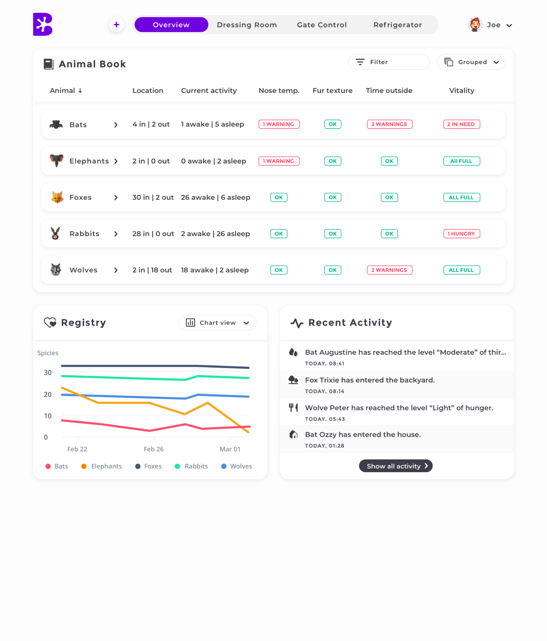
Let’s look at the problem again and define the end goal of our solution. In this case, it all comes down to making sure that the animals are safe and healthy. The need of the dashboard is crucial for monitoring the data. I started with laying down the main elements of the Overview screen, keeping in mind that it will be the focal point of the animal status, that can be checked in a very easy manner when needed.
Designing this view must provide a sense of clarity, simplicity, and trust for our users. So, creating an interface that is not overwhelming, simple and intuitive is a must, as well as the experience that can ensure that the user is aware of the animal status, health, etcetera, and knows clearly how the platform behaves and functions.
First I started with defining sections of the application taking into consideration Hick’s and Gestalt’s law. By focusing and narrowing down the needs it all came down to these 4 sections:
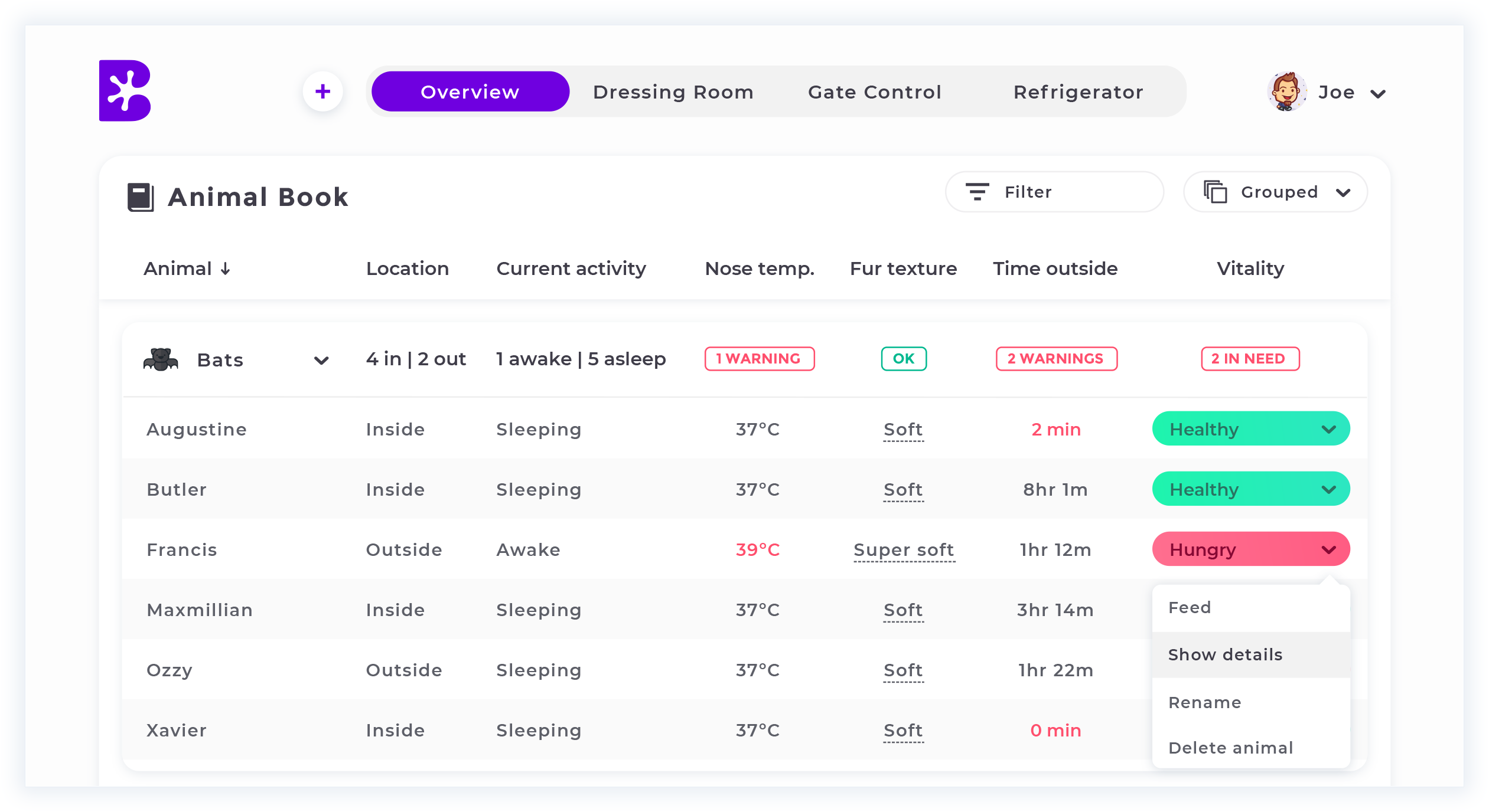
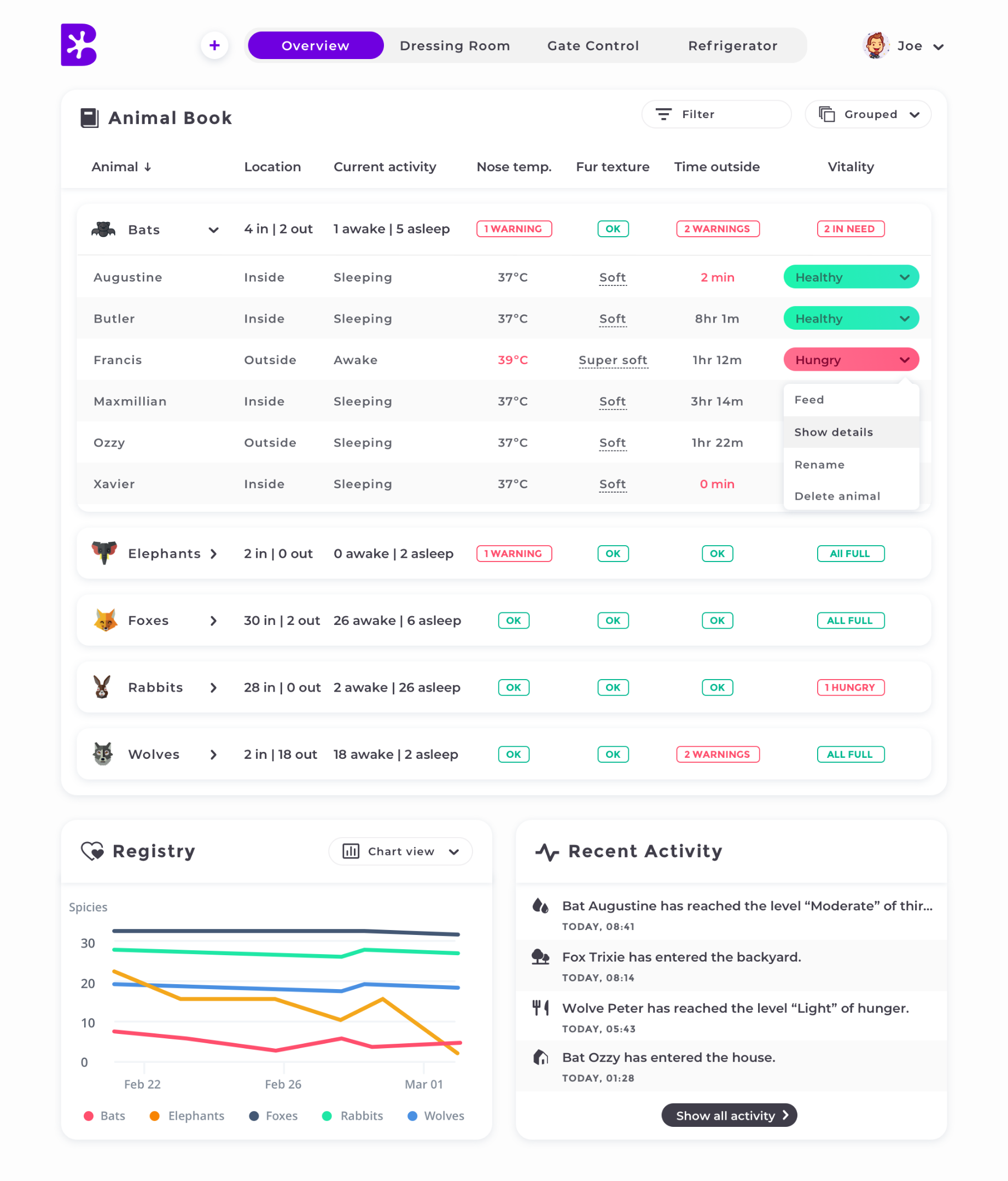
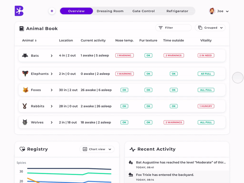
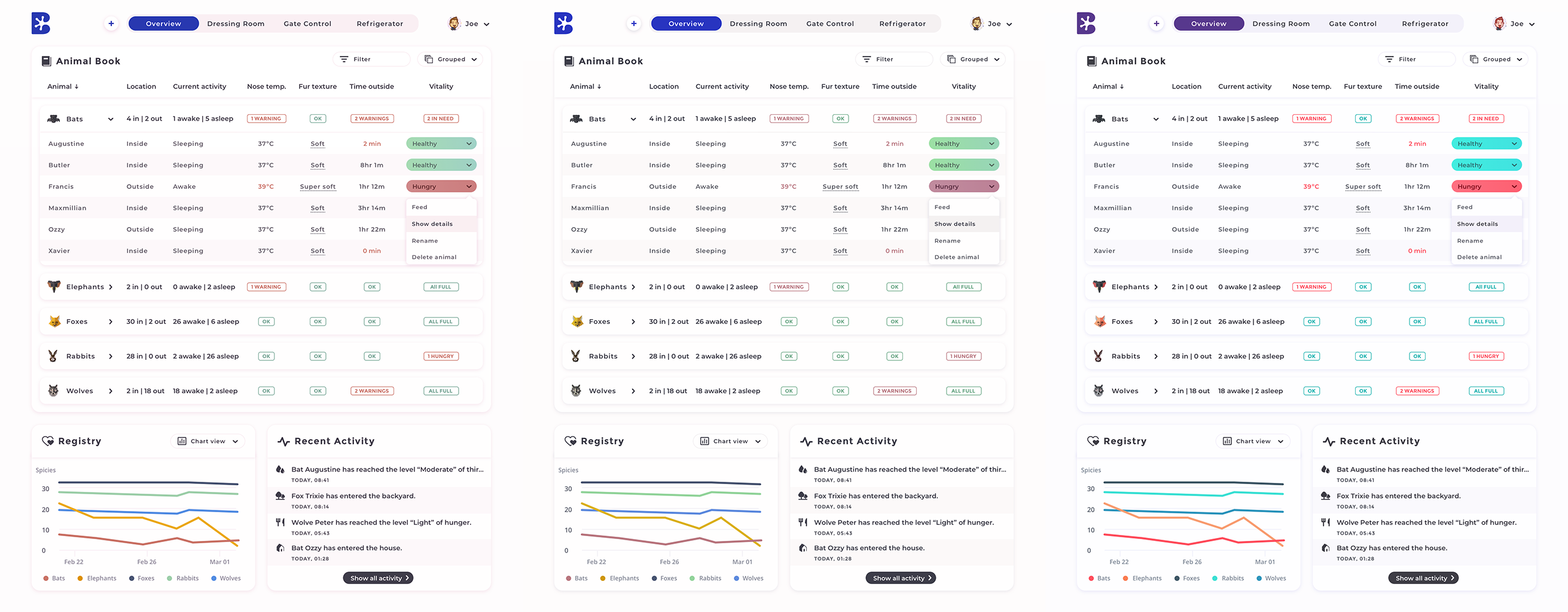
Overview: Displays the vital information of the animals from which it can be managed individually (adding, editing, deleting), and some streamlined actions as (changing fur texture instantly via popovers). Animals are grouped into foldable raws and later added animal head icons for better accessibility (Gestalt’s law). When unfolded, users can have a more detailed view from which they can observe the situation and make primary actions. All columns are grouped and categorized based on Hick’s law.
Dressing Room: Displays and provides control of animal appearance where you can adjust 3 parameters: tail color, tail size, fur texture. The table is grouped and provides the similar view as in Overview.
Gate Control: Displays gate control to the backyard (outside) which can provide an automized control depending on the time of the day, animal compatibility, animal needs.
Refrigerator: Displays amount of food supplies and provides basic to track and order functionality.
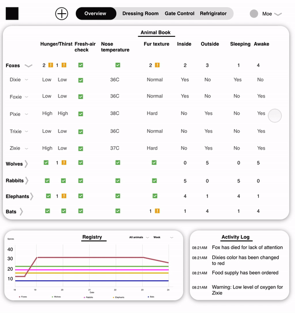
First explorations of the modular layout
Keeping in mind that our first #1 premise is to provide vital animal information first, and having the basic necessities for the layout described above ready, I started by putting the basic data parameters into a table and after having basic action controls and vital information on another side of the table taking into account Z-pattern of reading data and enhancing user experience (see final mockups). Having all the vital data and controls in one place is a must to be accessible. Therefore, it is aligned to the right side of the table.
Having those paradigms ready, it will be easy to use and control data in the other sections of the application.
Also, having the modular system of the panels lets me add quickly new panels or features and scale the product seamlessly and effortlessly for both users and developers.
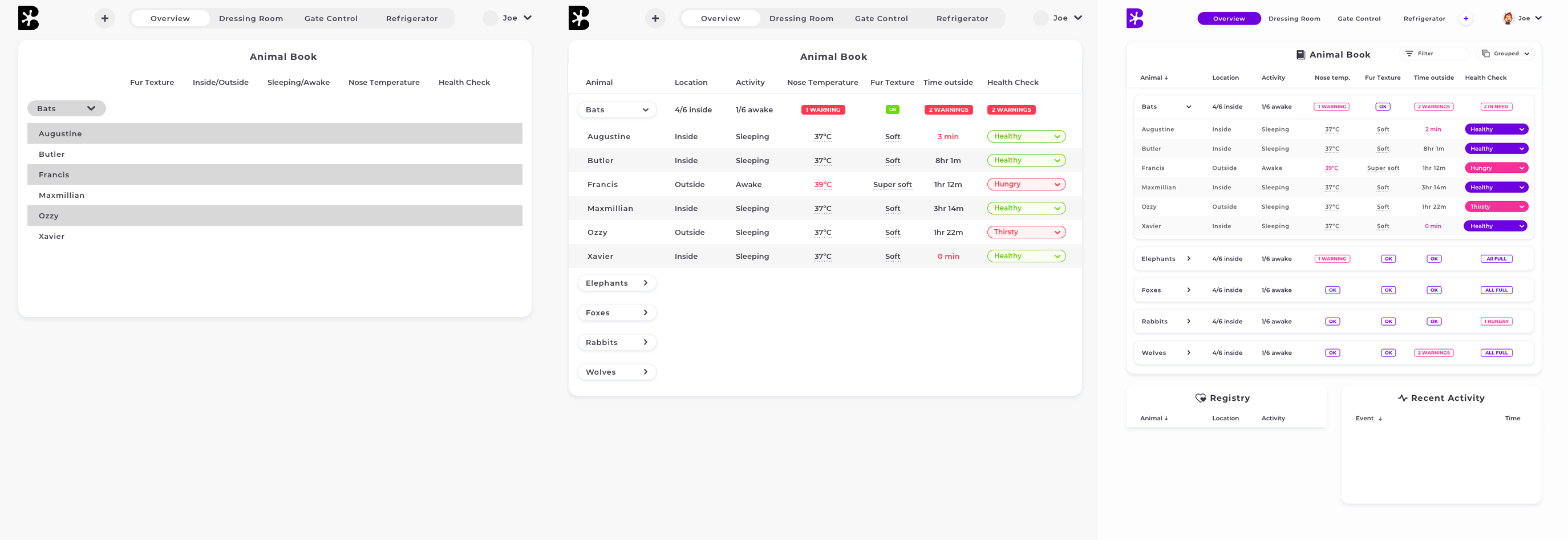
Early iterations of Overview section
Final Hi-Fi mockups
Animation
Accessibility
Color blindness test – Simulations of deuteranomaly, protanomaly, and tritanomaly (left to right)
Final thoughts
All great comes and evolves through a vast amount of iterations and design cycles and user testing.
Some of the things I missed or felt rushed:
- User research and iterative prototyping is a crucial role in this process, so I kind of “eyeballed” a few things to save time
- I hit the time ceiling very fast after getting a taste of the process and didn’t have enough of time mastering on animations, which actually wasn’t a priority of the assignment
- Lack of time to focus on the streamlined flow
- Doubts about sorting data in the table. That’s why I put a table toggle for grouped/ungrouped views.
- Implemented a lot of elements that users a familiar with or learn to use very quickly
- Didn’t focus enough on the most important part of the process – reducing user interaction by automizing the solution. Not so much thoughts were put as what the exact user scenarios are.
Selected Work & Projects
About MeInformation page

My Bucket ListFilmmaking
SynthesisMotion Graphics

Featured Art PrintsProduct Design
iPhone PhotographyPhotography
3 Marathons. 3 Cities. 3 Years.Personal Challenge
One Book. One Week. One Year.Personal Challenge

One Second. One Day. One Year.Filmmaking