PRODUCT DESIGNER, 2017 – 2020
In October 2013, I joined Greenqloud, a cloud computing software company offering cloud computing software and services. In May 2014, the company was pivoted to a pure software company with 100% focus on building and developing the cloud management platform Qstack. In August 2017, Qstack has been aquired by NetApp, a Fortune 500 company that provides solutions for hybrid cloud environments.
The Fabric Orchestrator work has been re-aimed towards Astra Control product in April 2020.
About NetApp
NetApp, Inc. is an American multinational storage and data management company headquartered in Sunnyvale, California. It has ranked in the Fortune 500 since 2012. With the advent of cloud and white box, NetApp now extends its services to cloud and white box servers. NetApp's Cloud Unit is incorporating QStack into its own hybrid cloud data services system that will be complementary to its existing cloud and data offerings.
Timeline
May, 2014 – Initial design and implementation of the web app for an upcoming demo in with 3 weeks of given time. having only one dedicated front-end developer.
June, 2015 – Complete design overhaul with new features with unification of our visual style and a brand new design. Our design system wasn’t equipped to to provide standards that unified the look and feel of all the system need across the many tabs and categories. As a result, our UI became inconsistent between old and new designs, making it difficult to use, scale up, adding new features, etc.
October, 2017 – Complete UI redesign.
March, 2019 – Design System implementation.
October, 2019 – Public Preview of the product.
Tools
Sketch App, Abstract, MeteorJS, InVision, Jira, Slack.
Introduction
One of my first big projects was to design from ground up the UI for the cloud management platfrom. The idea was to create an easy way to view, create and manage cloud resources in the Web UI. We introduced the first running version of an app for an upcoming demo in crazy short 3 weeks which later has been served its purpose for the next several months a few minor redesigns, until June 2015, when the second iteration of the Web UI has been developed.
The current UI has taken a lot of hard work, trial and error and a lot of rewrites and redesigns. But that is the hallmark of a good UI/UX, never settle for anything but the best and always strive for perfection. You’ll never get there, of course, but you have to try anyway.
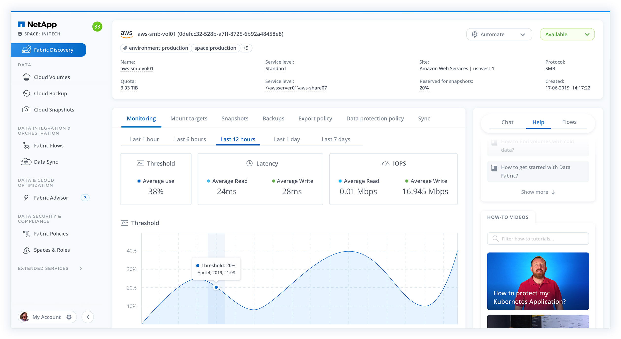
Have you ever wondered why all those cloud computing interfaces are so darned complicated? Why is the action to launch a new instance sometimes a seven step wizard? I mean, you just want to start up an instance, assign it an IP number and open up a few firewall ports to be able to setup and launch your WordPress site.
Designing Forms
In the instance creation form, you can basically open it and click the “Create instance” button at the bottom of the form straight away. That will start an instance with preselected values for all required fields, keypair, firewall, image, zone and service offering. It will even reserve and attach an IP for you as well! You can tweak the values, of course, but it’s just that simple. On top of that you’ll get notifications and visual indication of the status of the instance creation, updated in real-time.
And for every new feature we add into the UI, we try to make sure that the ground rules apply for every new view and action. A good example of that is our Kubernetes integration, where you can, with a few simple clicks, get a Kubernetes cluster up and running and then easily add new applications, with the world’s first Helm UI integration, and monitor, scale and/or update them, all inside the UI.
Designing Tables
We’re data management company, not storage. Data – raw material of the global economy. Data is useless without the ability to visualize and act on it. The success of future industries will couple advanced data collection with a better user experience. In my opinion, the biggest challenge with designing enterprise-level platforms is the lack of patterns that work or don’t work in specific scenarios. We’ve tried to pinpoint the most common tasks needed to perform for all those resources so they are readily available to you at the click of a button.
Designing Detail Views
The same philosophy applies to the administration parts of the UI, for domain and/or infrastructure admins. Same list structure, the same simple forms, everything to make the experience of maintaining and administering your cloud setup as smooth and easy as for the day-to-day users of the system. But even though we have, in our opinion, a superior UI we don’t want to exclude all the power users out there that want to automate everything via APIs, so everything you can do through our UI is available through API automation as well.
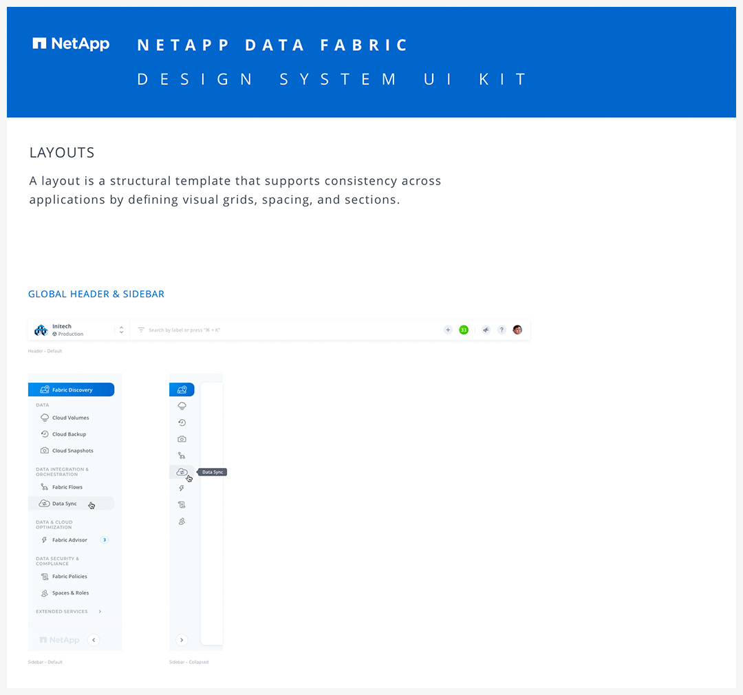
Building Design Systems
Design system is bringing everything together, from typography, layouts and grids, colors, icons, components and coding conventions, to voice and tone, style-guide and documentation, in a way that allows your entire team to learn, build, and grow.
For the last 2 years, having a design system have been a way for our product get designed, developed and deployed more efficiently. I've started with something that I called a Sketch UI Kit that included brand, color palette, typography and a suite of symbol based modules, cards and elements, which later evolved every time our feature or component requirements couldn’t be met by the existing system. Continuous improvement became a methodology, where every update was absorbed into the overall design, development and documented ecosystem.
In the section below, you can see Version 2.0 of the design system developed in 2016, and Version 3.0, started in 2017, which is continuosly improving and adopting to our development process.

The Platform Evolution
Our platform went through three big overhaul redesigns in the last four years. Each iteration started not only by analyzing the new priorities, goals, and user's needs it needs to inherit, but also by looking back at the unique scalable architecture that allows to work and manage data in a very simple way, and evolving it all to the next level.
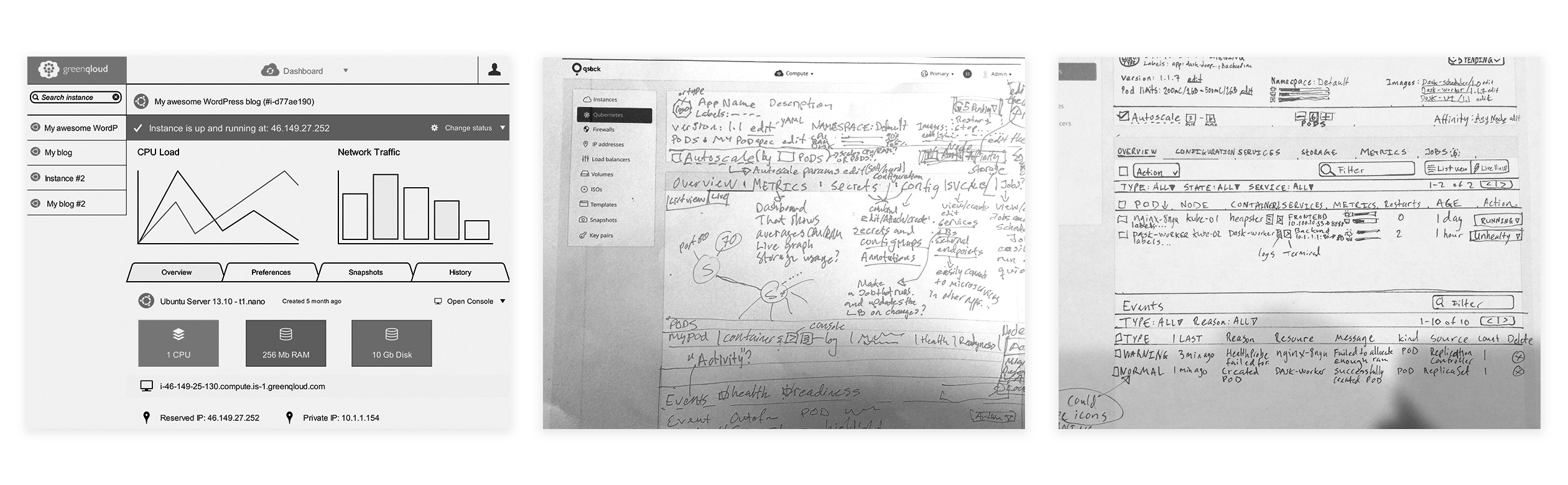
Wireframes and sketches – Versions of 2014, 2016, 2017 year (left to right)
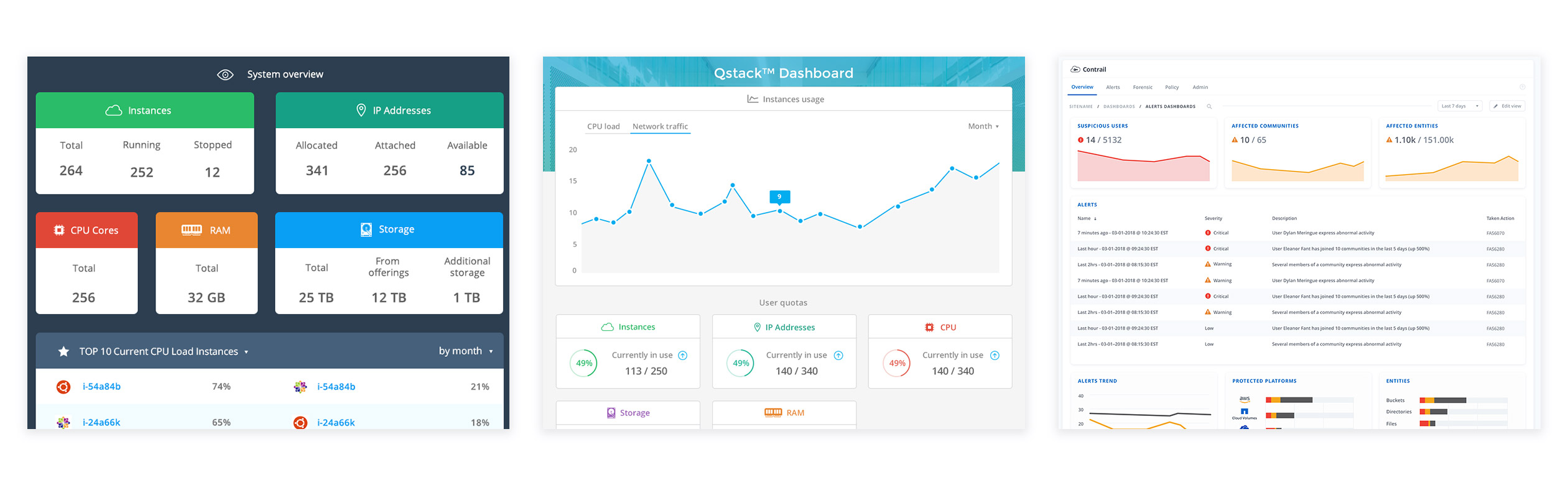
Dashboard – Versions of 2014, 2016, 2017 year (left to right)
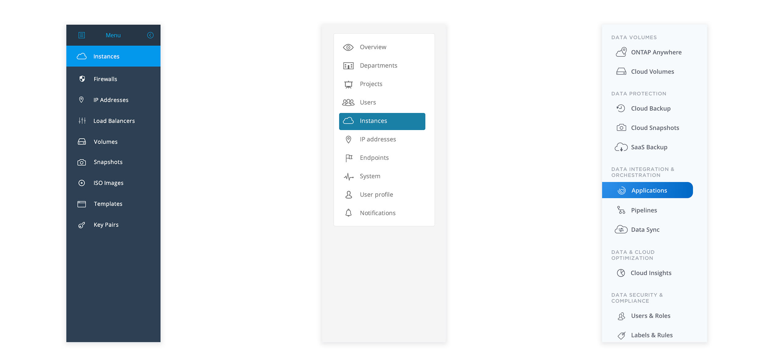
SIdebar – Versions of 2014, 2016, 2017 year(left to right)
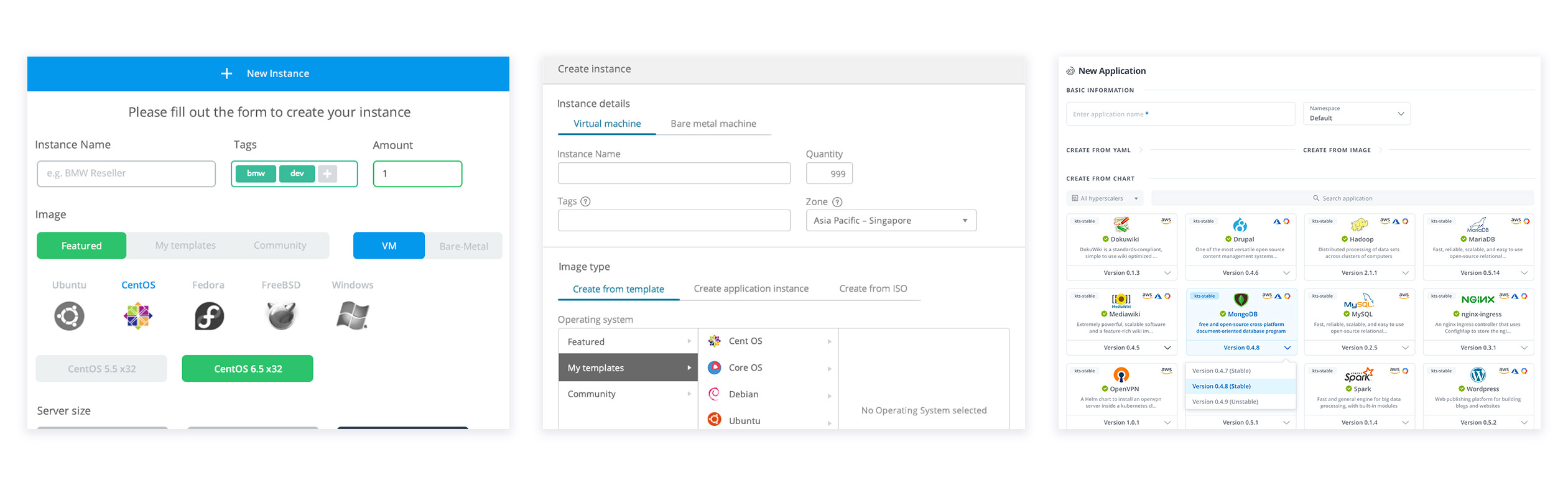
Create section – Versions of 2014, 2016, 2017 year (left to right)
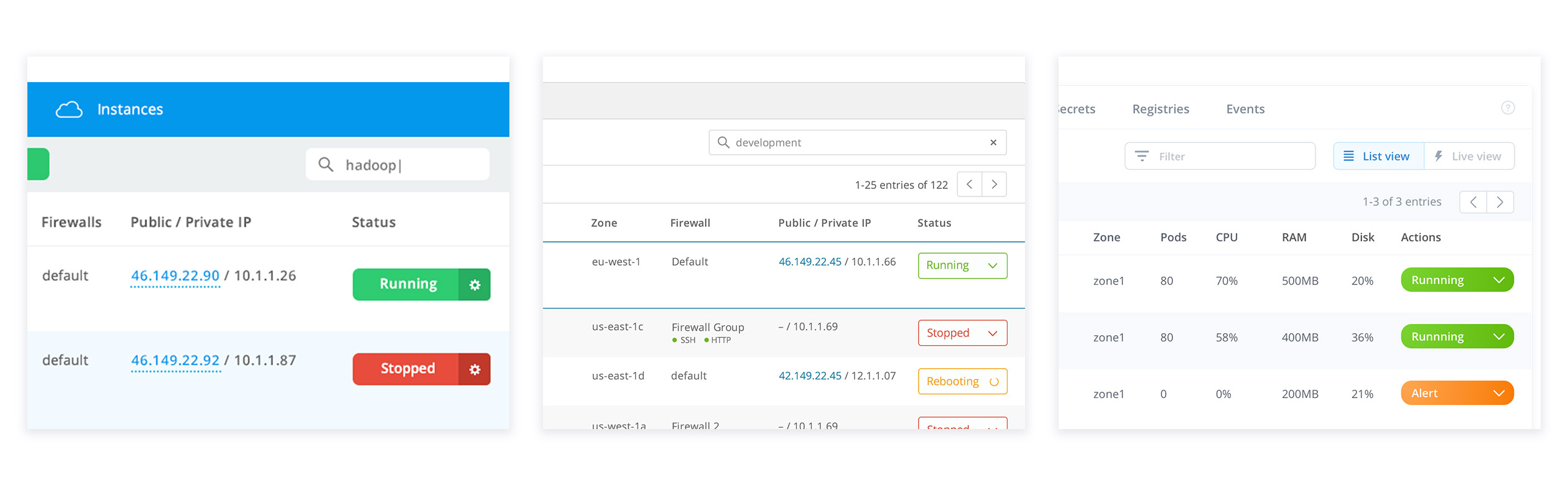
List – Versions of 2014, 2016, 2017 year (left to right)
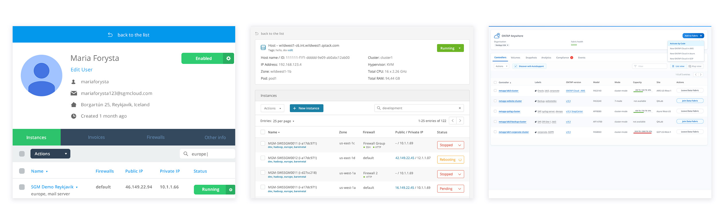
Section details – Versions of 2014, 2016, 2017 year(left to right)
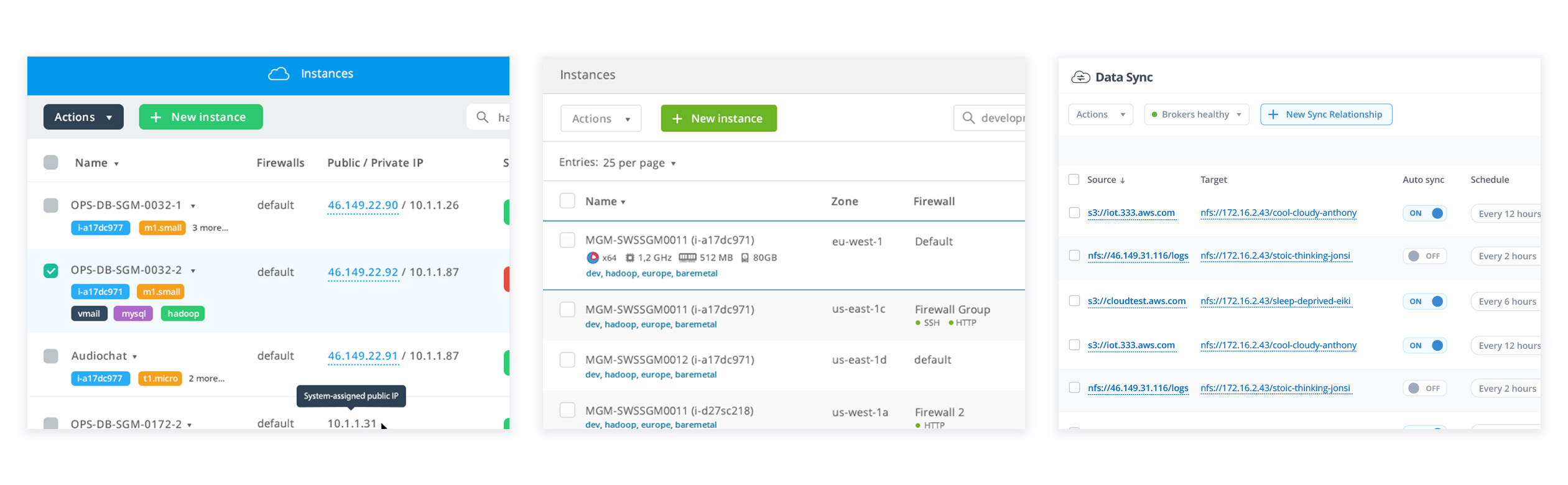
Section view – Versions of 2014, 2016, 2017 year(left to right)
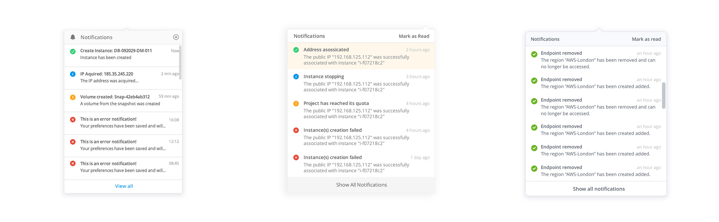
Notifications – Versions of 2014, 2016, 2017 year(left to right)
Selected Work & Projects

About MeInformation page

My Bucket ListFilmmaking
SynthesisMotion Graphics

Featured Art PrintsProduct Design
iPhone PhotographyPhotography

3 Marathons. 3 Cities. 3 Years.Personal Challenge
One Book. One Week. One Year.Personal Challenge

One Second. One Day. One Year.Filmmaking