DESIGN EXERCISE, MARCH 2018
In this design exercise, I chose to design an in-car interface for a self-driving car. I focused on doing a research of problems passengers might have, identifying motives and fears. Having those in mind, I crafted a basic look of Control Center, animated the screen-flow, and made an accessibility test of the interface.
Tasks & Problems
The subject in this case is a fully self-driving vehicle, in which touch interface plays a key role in crafting the overall experience for users. The passenger can use this interface to monitor the vehicle's statistics, adjust climate control, play music, engage route guidance, etc. It’s intended to be simple to use and understand, and since it will replace traditional hardware buttons, it should still feel tactile and straightforward to the user (think on/off buttons, sliders, etc). The interface should be intended to be broadly appealing and easy to use, not directed specifically towards any one demographic.
Tools
Sketch App, Abstract, Principle for Mac, Adobe Photoshop.
Process
I usually start my process by identifying the basic goals, narrowing down main priorities of users, identifying fears, motives, and problems. Let's write those down:
Premise: Press a button, get to your destination. Fast. Safe. Comfortably.
Goals:
- Provide a clear sense of what the car can see, and what the car intends to do
- Create mutual trust between passenger and the autonomous vehicle
- Focus on usability and accessibility of the interface
- Simple, familiar and intuitive UI, yet very functional that provides instant control
- Streamlining the workflow
- Customization of the modal panels
- Create an experience that will make riders comfortable and safe.
Users:
- Kids/students – unexperienced but wants to get around
- Business People – looking to be more productive with their time
- Elderly – Uneasy about driving/technology but needs assistance with normal routine.
Problems:
- In a hurry
- Want to control
- Prefer a particular route
- Aggressive drivers
- Conservative about AI
- Not tech savvy.
Motives:
- Curiosity
- Increased productivity
- Experience a unique form of commuting
- Ease and convenience
- Napping during a commute.
Fears:
- Lack of trust, control
- Route change
- Split-second decisions (route changes).
Identify:
- Identify the common sources of anxiety regarding driverless vehicles
- Make sure riders aware of real-time changes
- A theme of UI for a very diverse group of riders (colorblind test, voice control features, clear tactical/voice/visual feedback).
Keep in mind:
- More autonomous the car – less dashboard aka “How often do look at the dashboard when driven in a taxi?”
- Touch size of the UI elements within arm’s reach, the real size of the screen
- Customizable split screen for right/left sided drivers
- Customization (folding/unfolding panels)
- One bar that is always prominent for easy and instant access to car controls/monitoring
- Dark mode for riding in the dark
- Streamlined workflows
- One place for all car settings
- Suggested events (rider’s recent locations work/home, calendar events airport, hotel, meetings)
- Status of the car/trip – the face of the driver.
Let’s look first what our riding experience in a taxi, Uber, or Lyft, and observe how we behave in different scenarios. People most likely to look at the driver’s face when they want to make sure that he or she is in total control, therefore they feel safe. It’s instinctive human behavior so it won’t disappear of this new technology, so I think it’s better to adapt to it. So with replacing the “face” of the driver with one landscape screen, we need to keep in mind that it will be the medium that you can check at any time in a very easy manner when needed.
Creating this medium must ensure that there’s mutual trust between two. So, creating an interface that is not overwhelming, simple and intuitive is a must, as well as the experience that can ensure that the rider is aware of the car experience and knows how the car functions (think “Boston Dynamic” robots are scary, vacuum cleaner – not).
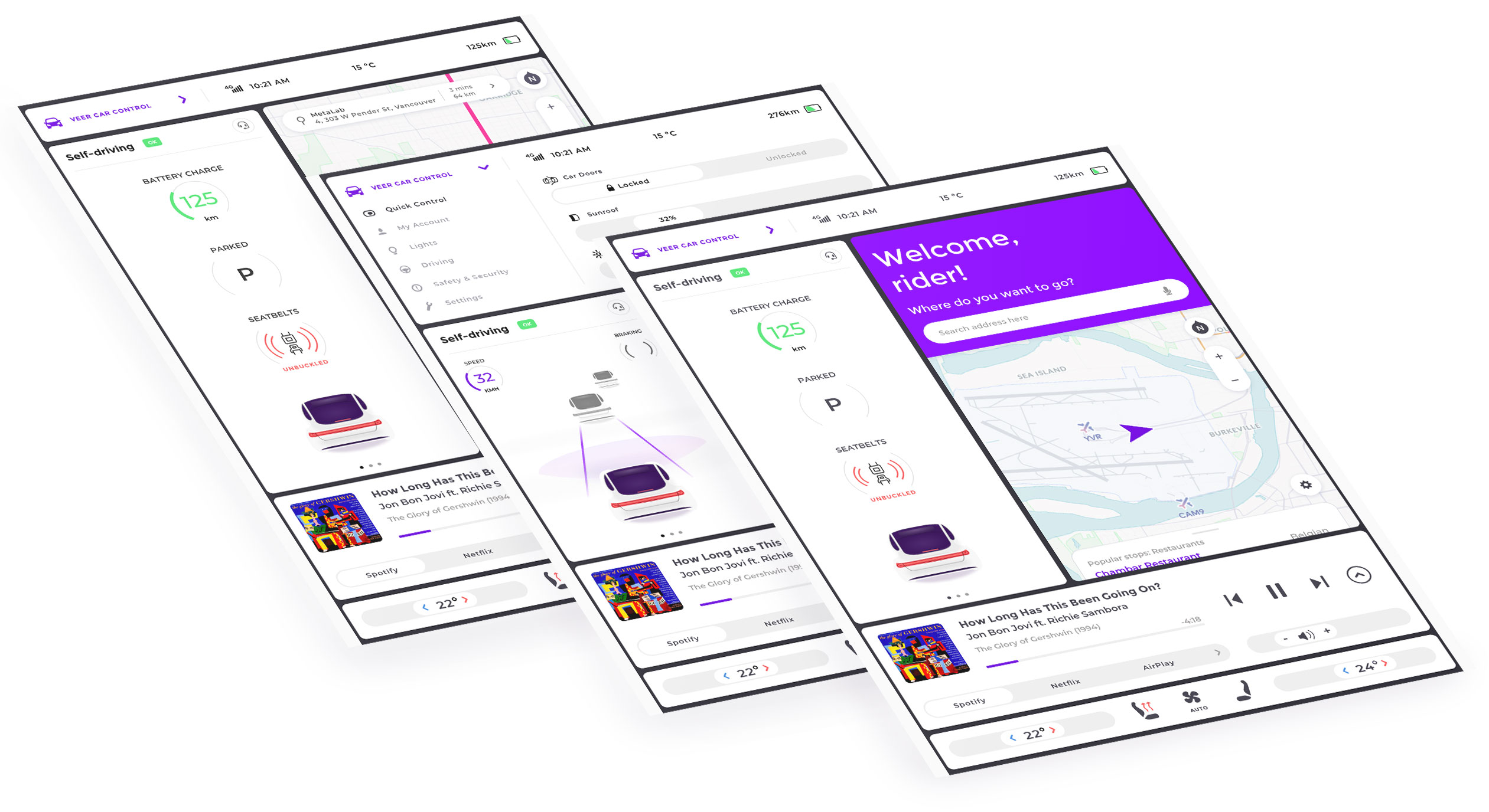
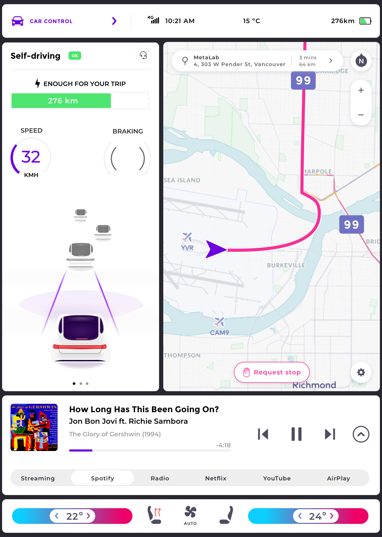
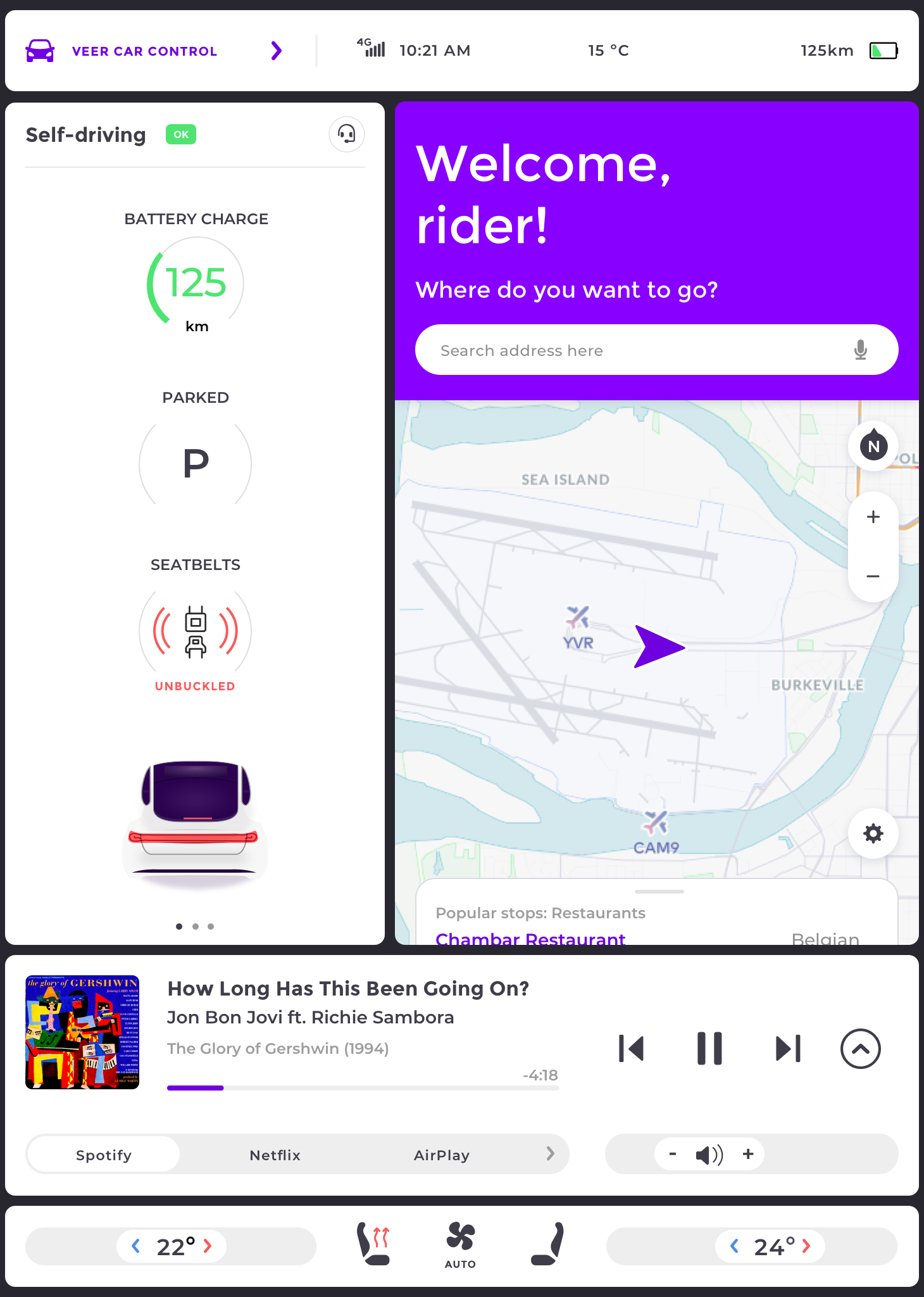
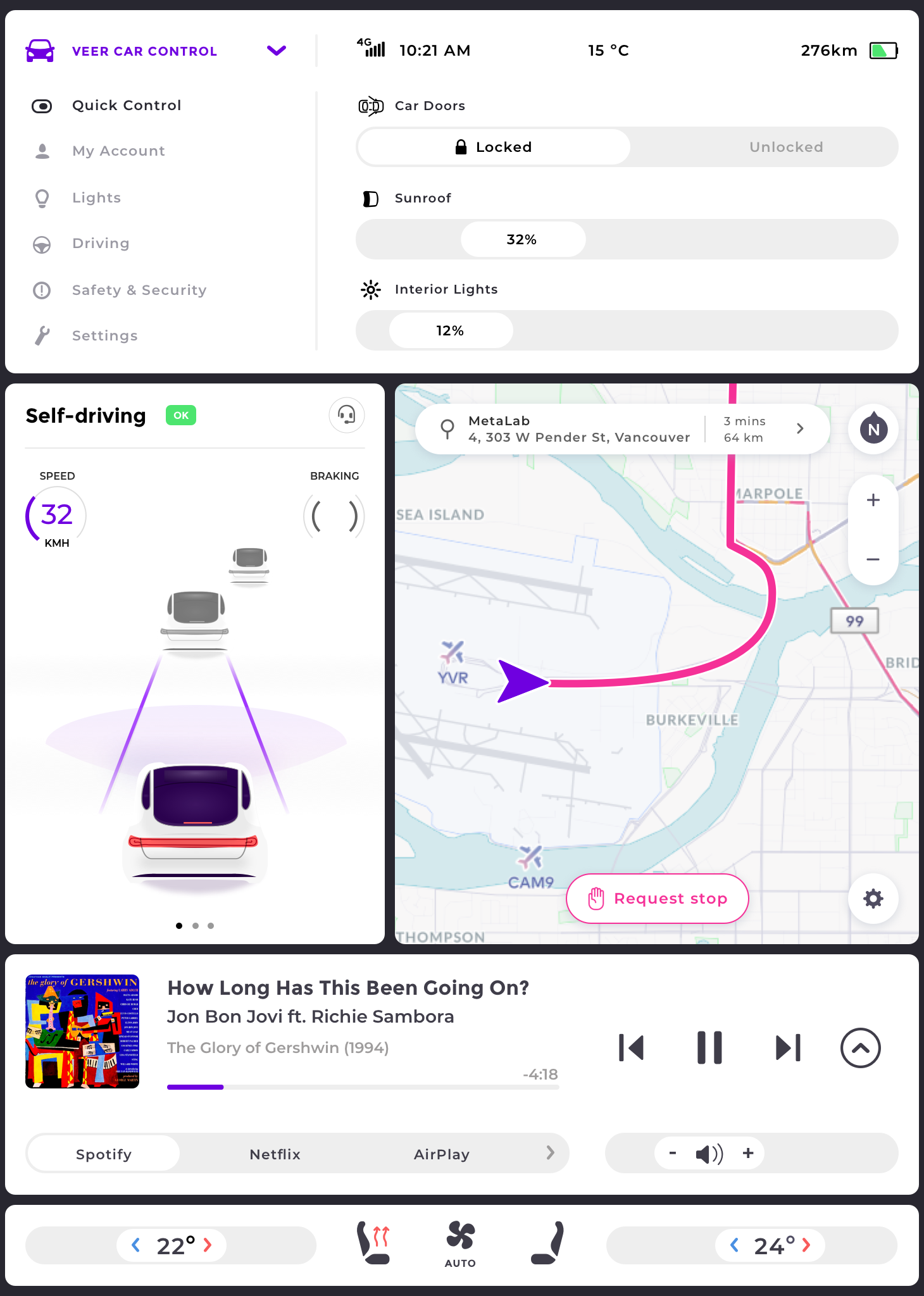
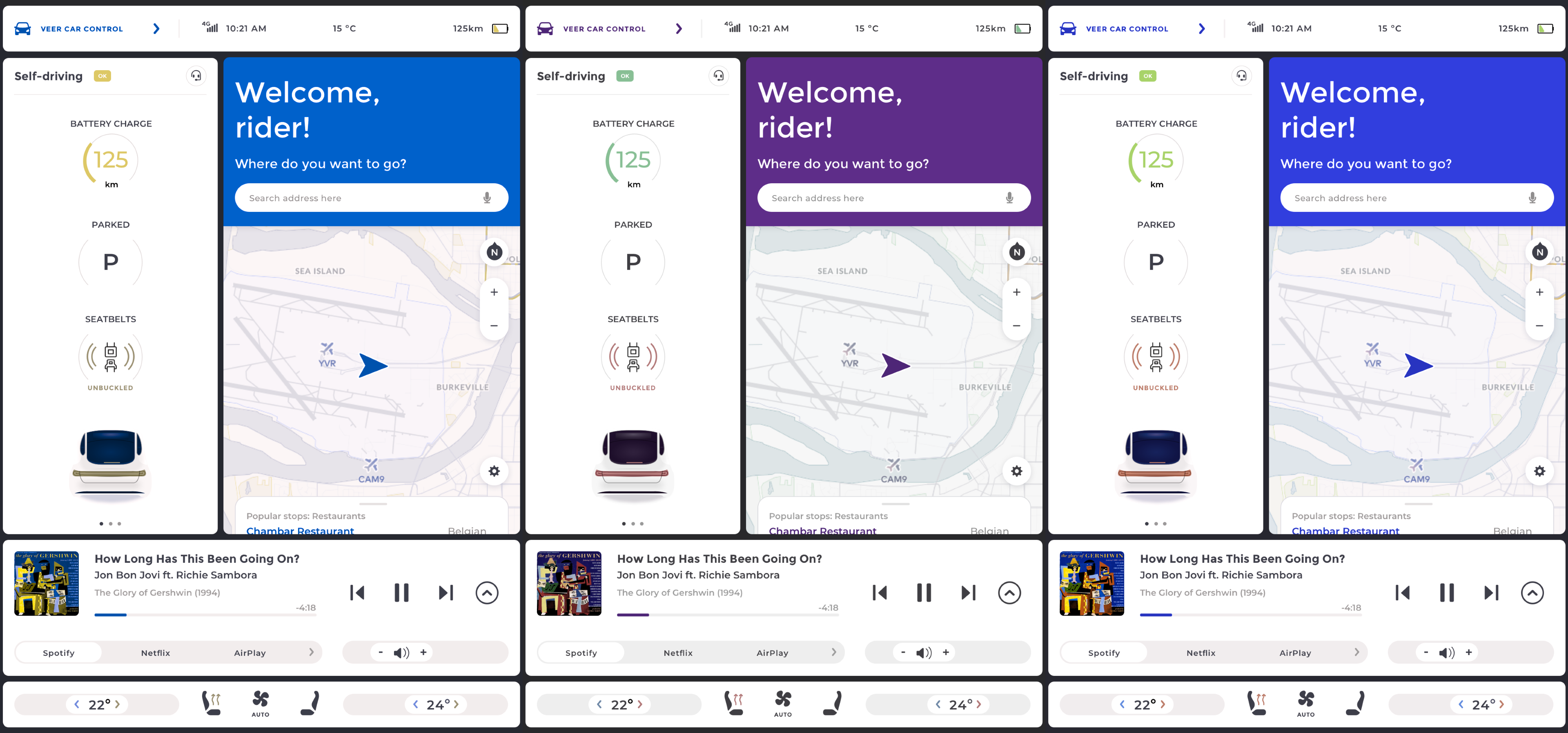
First I started with having it in landscape (Mockup #1) as most likely users will be engaged in using the entertainment system (watching in landscape) during the ride, but I went to try the portrait layout (Mockup #2 ) as it’s more adaptable for streamlining more information (think about smartphones getting taller).
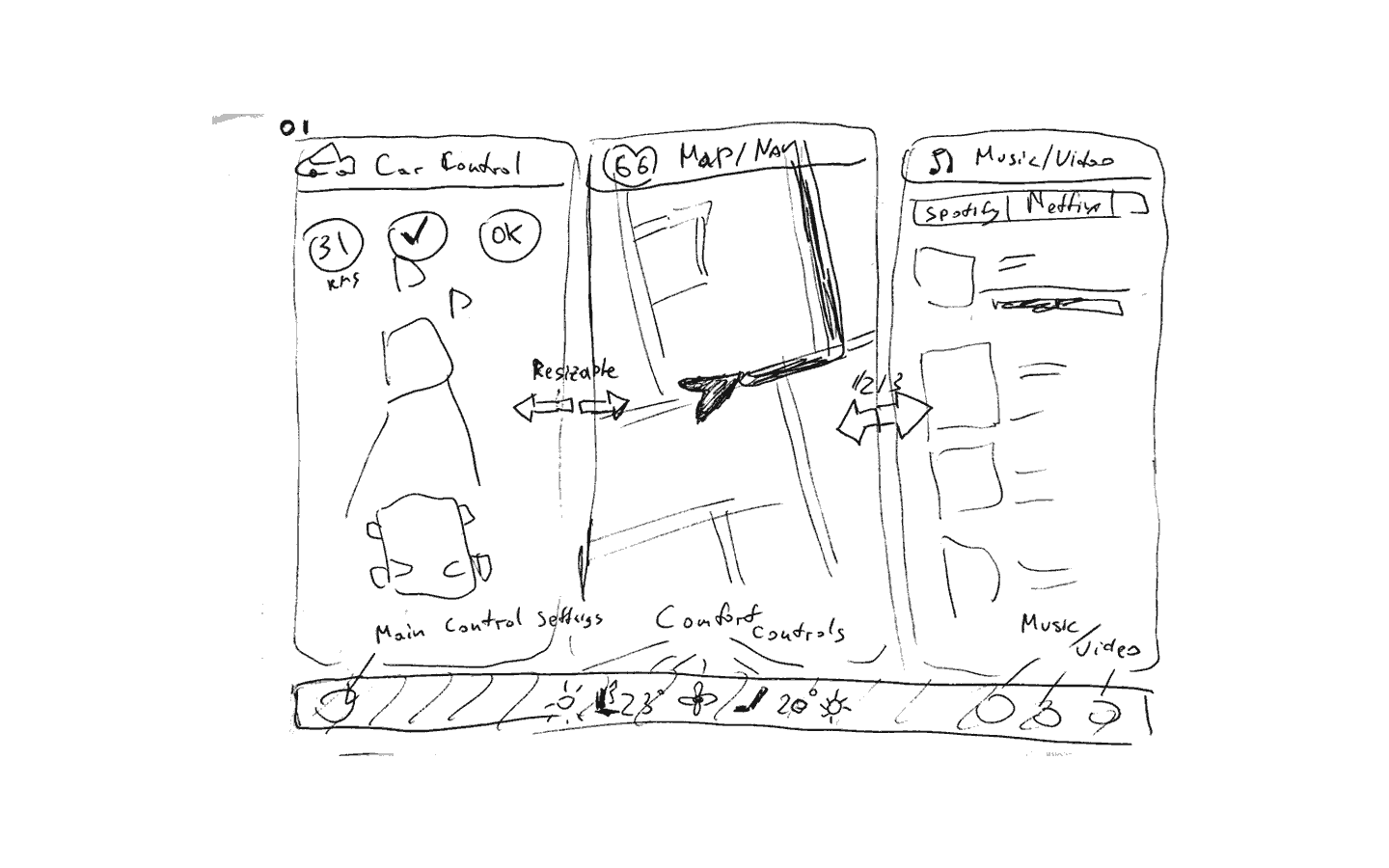
First explorations of the modular layout
Map View: Always display the route so riders can predict the car’s moves, navigation tools.
Car Status: Always (!) show where the car, show what it is doing at that exact moment, and what it sees around us. It has a schematic view of all the cars, bikes and pedestrians, which should be easily understandable.
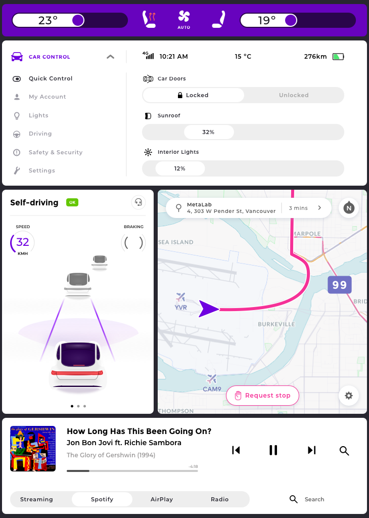
Car Control: Display car control which is sorted by prioritizing the most used items and have Quick Controls tab for easily customizable controls.
Climate Control: Display controls for air-conditioning, heated seats, fan controls in an instant.
Entertainment: Display entertainment system and have quick access playing from different sources and quick and smart control of the most used control – volume.
Portrait mode explorations
Then I went with something riders are familiar and has the flow people know how to use (Tesla’s dashboard, Uber’s paradigms, and any of current ride-sharing best practices). Other things, I had in focus is to have a modular UI, that can always show where the car (Map View) and what is it doing in that exact moment (Car Status), car controls with quick controls (Car Control), air-conditioning/seats control/fans (Climate Control), entertainment system (Entertainment).
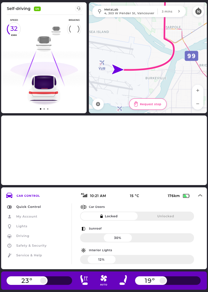
Early iterations of design
Keeping in mind that our first #1 premise is getting to from A to B in the easiest way, I thought to start from having a fullscreen welcome screen and after having a destination entered to get the rider moving and then show all the controls/entertainment panels. But quickly by doing more research on other scenarios, it wasn’t ideal. What if you get in the car and have to wait for a friend to join, but want to be safely locked in during the night on a busy street. You need to have the Car Controls panel accessible in one touch. All similar scenarios led me to have a multi-panel view.
A not ideal solution in my opinion, but something to get started from. Also having the modular system lets me to add quickly new panels or features. Keeping those things in my mind I went through several iterations till I ended up with something I was relatively satisfied.
Other things that noticeably evolved are:
- All priority controls/settings are kept in the range of only 4 panels and can be extended
- Car Control gauges, showing in at the proper situations (speed/braking gauges are hidden when parked), plus the ability to add sub-views (pagination)
- Tab selectors (e.g. Entertainment tabs) had to fit more items, therefore I added a swappable action on it to fit more in the same width (right arrow)
- Sliders might not look easily accessible for this kind of UI as it’s hard for example set a temperature from 22℃ to 24℃ if the slider size is less than 20% of the outer element, but it improves a lot by another layer of touch events, as touch spots at the corner sides of the outer element it is sliding in. So, now by simply tapping on the side of the outer element you can easily increase or decrease by one increment as well. Pop-over is a must in for these sliders, because of the finger obstruction
- Other temperature controls are switching through presets by a single tap on the icon (seat heater)
- Shifted back from having temperature control outer element colored in blue/red to plain grey, but added colored the arrows for keeping the accessibility
- Merged all car settings in one extendable panel “Car Controls” for having one place for keeping all the second level status information (time, network reception, outdoor temperature, battery) and car settings.
Final Hi-Fi mockups
Animation

Accessibility
Color blindness test – Simulations of deuteranomaly, protanomaly, and tritanomaly (left to right)
Final thoughts
All great comes and evolves through a vast amount of iterations and design cycles and user testing.
Some of the things I missed or felt rushed:
- User research and iterative prototyping is a crucial role in this process, so I kind of “eyeballed” a few things to save time
- I hit the time ceiling very fast after getting a taste of the process and didn’t have enough of time mastering on animations
- Doubts about having a landscape view (as more suited/focused on rider’s entertainment experience)
- Lack of time to focus on the navigation flow (changing route, adding stops, etc…)tapping on the side of the outer element you can easily increase or decrease by one increment as well. Pop-over is a must in for these sliders, because of the finger obstruction
- Doubts about heat/volume sliders. It has a few ways of controlling for very easy changes/tweaks in one tap but would be interested how those perform in the real world
Implemented a lot of elements that users a familiar with or learn to use it very quickly - Neglecting the longest part of the journey – riding. Not so much thoughts were put as what are scenarios while being ridden
- Neglected voice control at this design stage for improved accessibility. Might need to increase the contrast of the faded elements as well
- More obvious access to “Assistant” in emergency scenarios might be needed
- More obvious hierarchy of the panes might be needed.
Selected Work & Projects
About MeInformation page
My Bucket ListFilmmaking
SynthesisMotion Graphics

Featured Art PrintsProduct Design
iPhone PhotographyPhotography
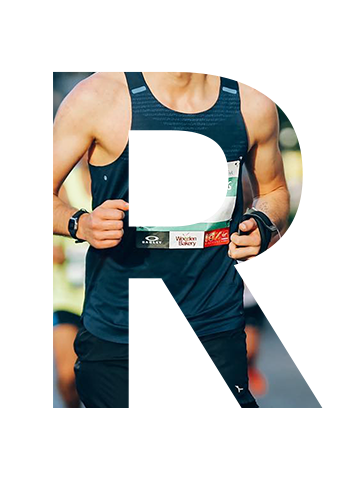
3 Marathons. 3 Cities. 3 Years.Personal Challenge
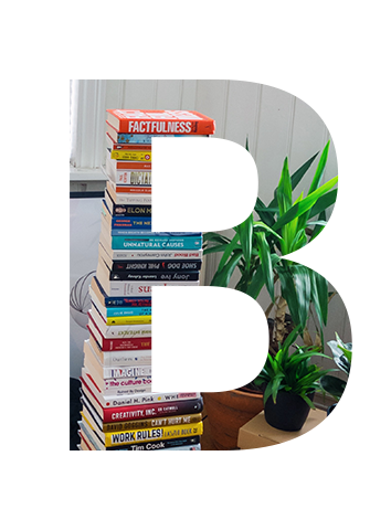
One Book. One Week. One Year.Personal Challenge
One Second. One Day. One Year.Filmmaking